
Molder & Forge Branding and Website
Overview
Molder & Forge is a massage therapy and personal training service based in Raleigh, NC. Inspired by rich textures and an aura of academia, Molder & Forge is a stand-out visual identity that speaks to a diverse audience of athletes, lifestyle clients, and businesses alike. As a solopreneur start-up, Molder & Forge faces challenges in establishing credibility with little existing brand capital. Our mission was to establish a trustworthy brand identity that balances the “femininity” traditionally associated with massage, and the “masculinity” traditionally associated with fitness to portray an inclusive wellness experience.
Services Rendered
01. Brand Positioning
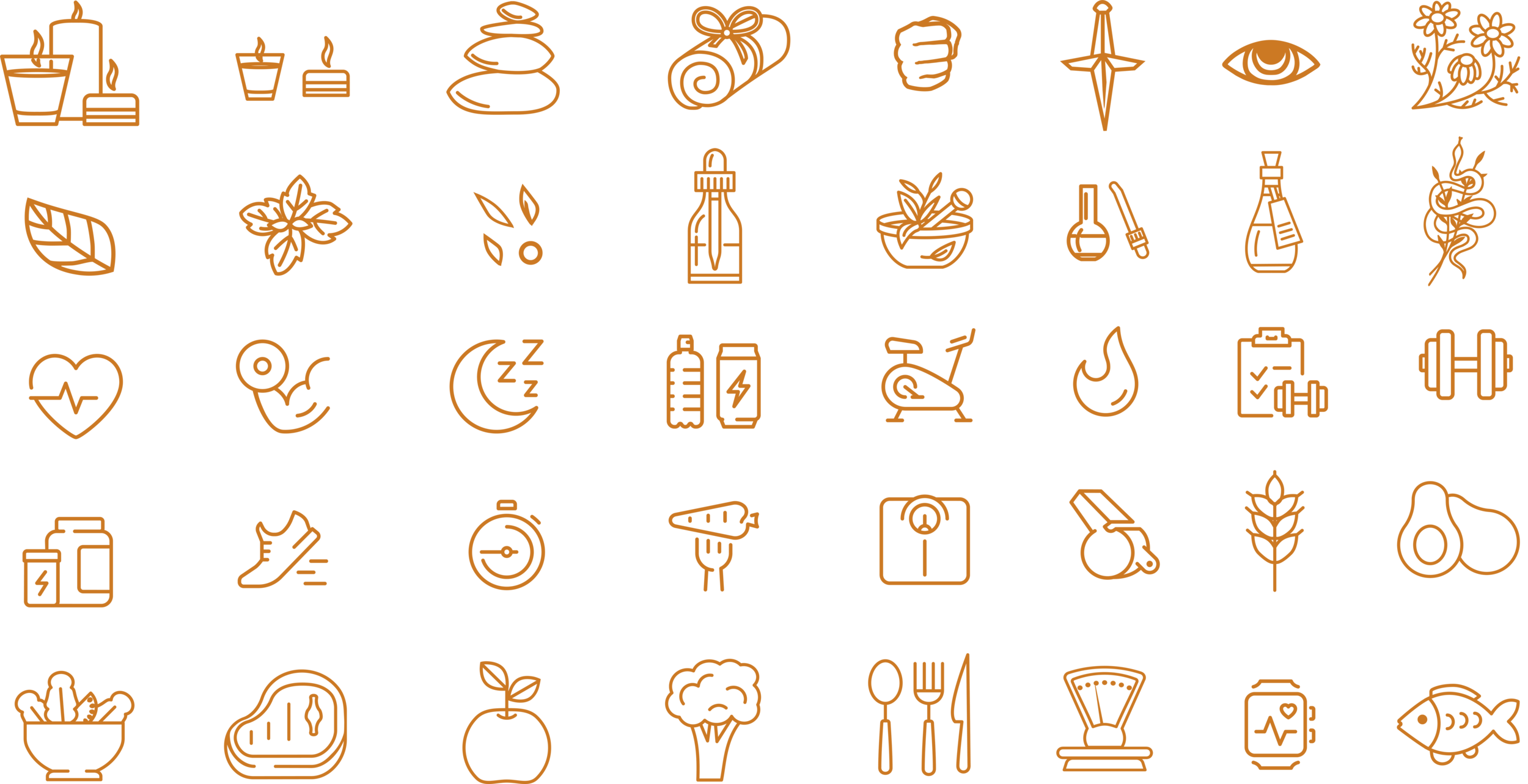
02. Visual Identity
03. Website
01. Brand Positioning

Accessible, Educational, & Compassionate
In contrast to prevalent archetypes within the fitness industry, Molder & Forge challenges notions of achieving an “ideal” body type by approaching fitness from an inclusive, educational, and compassionate perspective. Molder & Forge serves a diverse set of clients, so each client’s level of prior knowledge, athleticism, and comfortability with their body is different. Molder & Forge is positioned as a “trusted advisor” in personal health, with the goal of making your body feel better for your daily life.
The Molder & Forge branding emotes these values by walking the line between “edgy” and calming. This parallel of imagery allows Molder & Forge to cohesively speak about their two primary services—personal training and massage—while resonating with clients of all genders.
02. Visual Identity

Logo Concepts, Color Palette, and Design Motifs
The Molder & Forge visual identity is androgynous in nature; it is intended to resonate with a diverse array of clientele of all genders. The ambiguity of the brand identity denotes the inclusivity of the brand, as it is not intended for only men, only women, or only athletes to enjoy. The brand narrative is centered around the evolution of the peppered moth. The peppered moth, which, by adapting its body to overcome challenges brought by the industrial revolution, embodies the mission of the brand: to adapt your body to overcome any obstacle.
The story of the peppered moth, in conjunction with allusions to gothic architecture and a rich color palette, also evoke a similar sense of wonder as what you experience when walking through a historical site or vast library. The environment hosts a world of knowledge and draws you in to its mystery.


03. Website

User Journey & Experience
Molder & Forge offers diverse services in two industries to three separate audiences of potential clientele. Thus, when producing the Molder & Forge website, we faced managing a complicated array of services and pricing policies. Our primary goal for the website was to produce an educational experience for the novice massage/personal training client that guides them effortlessly through what can be a confusing purchasing process.
We first assisted Molder & Forge with optimizing the organization of their services and pricing to ensure clarity and transparency throughout the entire purchasing process. We then planned a thorough and thoughtful user interface, with the primary goal of guiding potential clients to the new client questionnaire that initiates their client engagement with Molder & Forge. Finally, we curated unique imagery and copy to transport the viewer into the Molder & Forge ecosystem.
To experience this website, visit www.molderandforge.com.